Case Study - Budgeting that stays calm
A native iOS expense tracker built around one question, how much can I spend, with automatic carryover, locale-aware currency, and a glass interface people are willing to open daily.
- Client
- Zenoney
- Year
- Service
- iOS Development, Product Design
Overview
Budgeting that stays calm
Product decisions
What we chose, and why
One question per screen
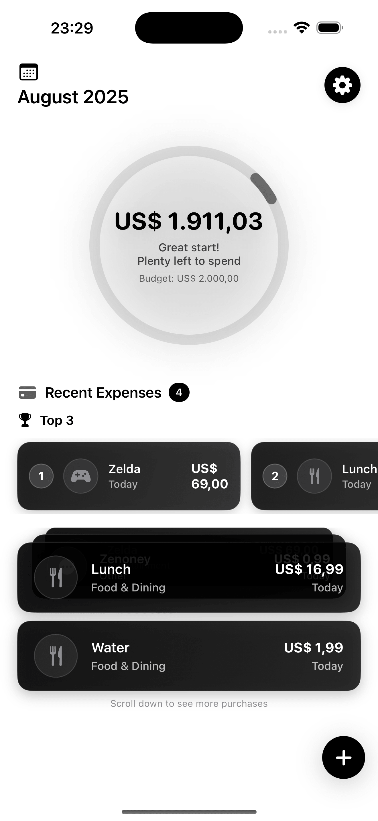
A budgeting app earns its place by answering “how much can I spend?” before anything else. The dashboard is a single ring and a single figure; everything else scrolls below it.
Carryover as a rule
Underspend a month and the remainder rolls forward instead of vanishing at midnight on the 31st. Budgeting apps that reset punish the good months.
Warn, do not scold
The ring shifts as the month tightens and the copy changes with it, from “Great start, plenty left to spend” early to a visual warning near the limit. Nobody needs a red alarm over a coffee.
Two languages, one currency model
English and Portuguese ship together, with locale-aware currency formatting throughout, so US$ 1.911,03 reads correctly whichever language the phone is set to.
Glass, not gloss
Layered translucent cards on a dark ground, with haptics on the actions that commit something. The finish is the point: a money app people are willing to open daily.
Product
Three screens, one job
Dashboard · the ring
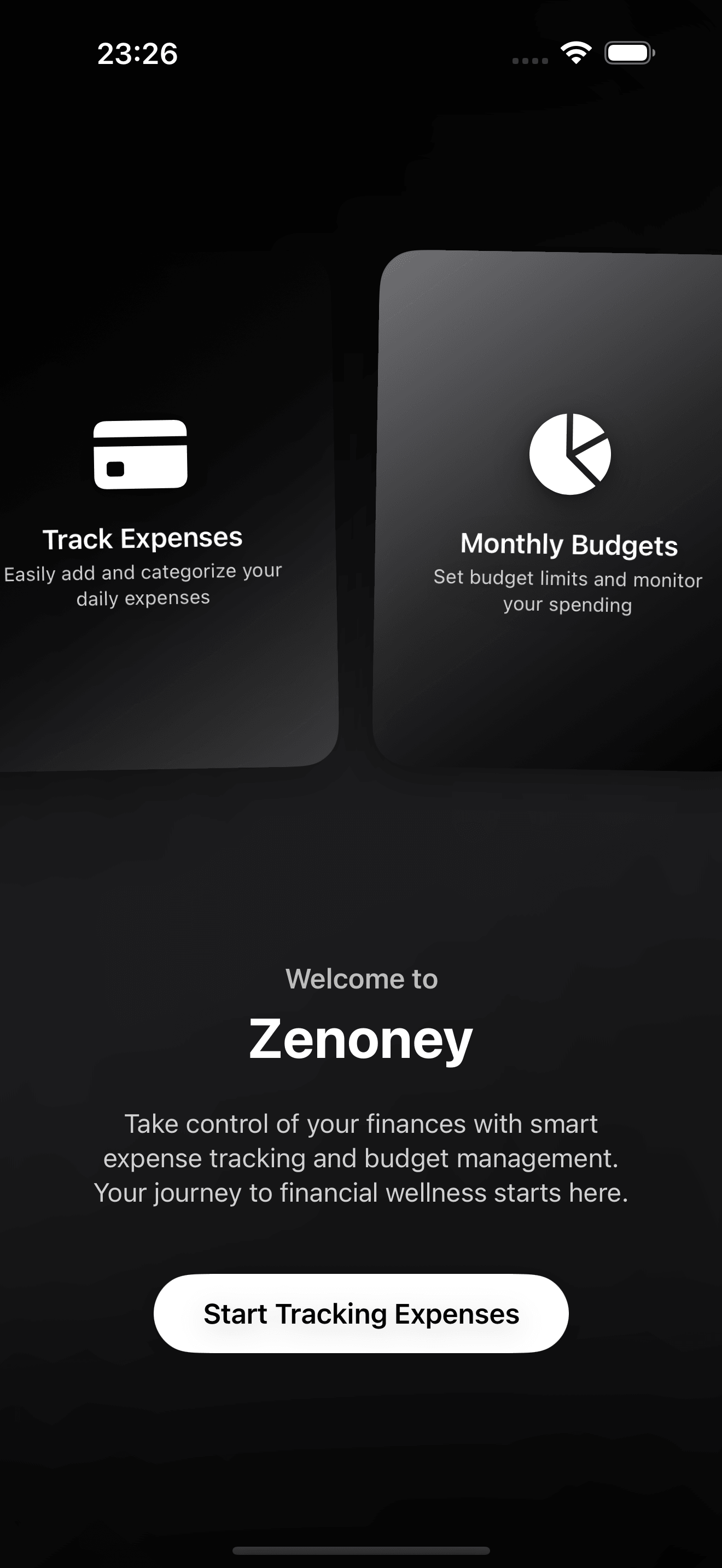
Welcome
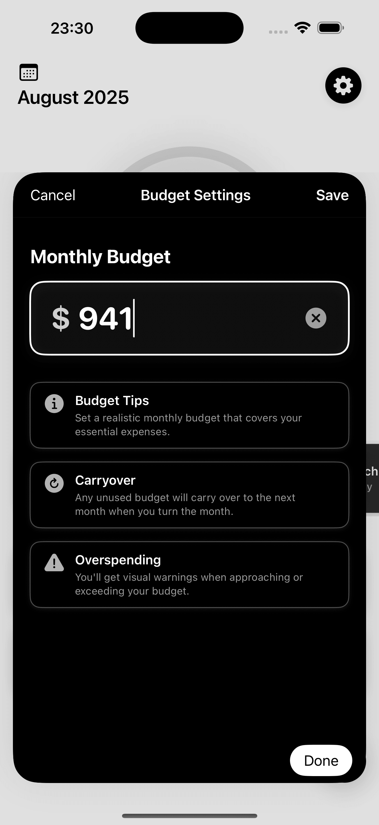
Budget settings
Stack & proof
Native, local, and locale-aware
The ring counts down from the month’s budget as expenses land
English and Portuguese, with locale-aware currency
Of an unused budget rolls into the next month
Analytics SDKs, accounts, or servers involved
Technologies
- Swift
- SwiftUI
- SwiftData
- Charts
- Core Haptics
- String Catalogs
- iOS 17+
SwiftUI carries the glass-morphic layering, Swift Charts the spending breakdowns, and String Catalogs the two languages. Amounts go through Swift’s FormatStyle rather than string concatenation, so US$ 1.911,03 and $1,911.03 are the same value rendered for two audiences.